
Checkout Overhaul
Techstyle: Fabletics // Mar. 2019
Fabletics is an activewear brand based around a skippable monthly subscription cost. When I joined the company they had been around for five years, and some parts of their website hadn’t been updated since launch.
Their checkout was in dire need of UX/UI modernization and data was showing a large number of users abandoning early in the check out flow. I was tasked with identifying who, where, why, and how to fix it.
For confidentiality reasons I have omitted certain metrics

My Role
Lead UX/UI Design
User Research
Competitor Analysis
Team
One Designer (me)
Six Engineers
Three Project Managers
Timeframe
Mar. 2019 - Jul. 2019
4 Months
Tools & Testing
Sketch, Invision, Usability Testing, User Interviews
Quick Summary
The Challenges
Redesign the Fabletics checkout to primarily increase conversion
Introduce a user-centered design approach to product the company culture and prove it’s value
The Solution
Uncover insights using qual. and quant. Data to get clear, accurate understanding of problems within our control shopping experience, with a focus on cart/checkout
Empathize with users and define the friction within the checkout flow
Ideate and look at competitors in our field to align with industry standard experiences
Mock and prototype flows to test and iterate towards the best possible design
How I Contributed
Worked with stakeholders, engineers, and project managers to outline constraints, scope, and KPIs to define success
Introduced and led user research and shared insights helpful in reaching our goals with this project, as well as painted a clearer picture of the existing quantitative data
Joined the retail team for their “Meet the Member” event in New Jersey to speak directly with some of our existing subscribers about their experiences
Create a redesigned, data-driven experience that exceeds our user’s expectations and makes us more more competitive within our industry
Designed and iterated to modern UI and UX patterns in partnership with the engineering team for a holistically better experience
Contributed to user-acceptance testing along with our QA team to ensure the site experience matched the mock ups
The Results
The redesigned checkout was shown to 50% of leads over 5 business days. Overall, leads who experienced new checkout saw over an 8% increase in registration and order conversion from checkout start.
Mobile - leads saw a 4.9% increase in registration and order conversion
Desktop - leads saw over an 18% increase in registration and order conversion
Overall the redesigned checkout generated 14.2% more in revenue and 9.2% higher registration (note: checkout is only a small piece of the registration flow)
Project Details
The Challenge
When I joined Fabletics in late 2018 they were significantly behind in UX maturity; There was no user research being done; projects were tackled from a top-down perspective which was resulting in wasted time and resources, and less than stellar results
Overhauling the checkout was my first (and possibly only) chance to demonstrate the value of a user-centered approach in order to prove a change in product culture was better for the business, the process, and most of all the user.
Initial Steps
Assessing The Situation
From some preliminary stakeholder interviews, I quickly discovered Fabletics checkout had never been redesigned. However due to complaints from the executives, now was the time to improve it from a usability standpoint as well as migrate to a faster codebase.
I decided to review the checkout flow starting from PDPs. This would omit grids and decision making, and start with the point a user has decided to add to cart and potentially checkout.
Overall the mini cart, upsell, cart, and checkout info sections all proved problematic. None of these steps seemed to be there with any intent. Instead they were just there for the sake of being there, lacking in any value or easing of the user’s journey.
S.W.O.T. Analysis
I put together a SWOT (strength, weakness, opportunity, threats) analysis to help align with stakeholders and PMs from a UX perspective and a baseline to keep in mind as we collected user testing feedback
Discovery
Meet The Members
One of the cool practices at Fabletics was a “meet the members” event run by the retail team which consisted of gathering existing subscribers in a Fabletics brick and mortar store, and providing a yoga class, breakfast, mimosa’s, and discussing overall satisfaction with their products.
I took it upon myself to see if I could tag along to the next one and to see if I could take some time to discuss the website, their experiences while shopping online, and specifically checkout.
Here are some of the notes I gathered:
While the feedback was valuable, it wasn’t the most insightful. Fabletics subscribers had their information saved for checkout, meaning all they had to do was add to cart, review the price and order summary, and tap checkout.
From here I took what insights I could glean (most being about navigation, product discovery, and membership) and decided to turn my focus to our leads demographic.
User testing with leads
Working with our CRM and Marketing teams I was able to identify a set of demographic criteria to use with our usertesting.com platform.
What did we learn?
The feedback gathered through tests I ran on usertesting.com proved much more insightful and highlighted the true usability issues with our checkout and tech shortcomings.
The core findings:
Users wanted all their order info in one place
Clearer error states at checkout
Easier form fields
Overall wanted to “feel more confident about their order”
A “better” mini cart
And more
Selected Tasks
You will be shown an ad. Imagine that you clicked on this ad to purchase leggings on a website. Move to the next task to continue.
Show us how you would add 2 pairs of the SAME leggings to your cart. Remember to think out loud.
How helpful is the information in the cart? Please explain your answer [5-point Rating scale: Not at all helpful to Very helpful]
What is your impression of the shopping cart page?
What information caught your attention?
What is the total that you would pay if you were to check out?
How useful is the information in the cart? Please explain your answer. [5-point Rating scale: Not at all useful to Very useful]
What additional questions do you have, if any, before you check out?
What is your impression of the confirmation page?
Overall, how would you describe your experience with the checkout process? Please explain your answer. [5-point Rating scale: Very difficult to Very easy]
If you had a magic wand, how would you improve the check out experience?
Putting it all together
I put the key learnings into a spreadsheet prioritized by user-value to present to my project manager and stakeholders in order to align on design elements and prepare for tech planning
Competitor Analysis
To gain further understanding of our demographic’s shopping expectations I looked to direct and indirect competitors to compare category taxonomy & standards.
Who did we look at?
Lululemon, Amazon, FashionNova, Bellroy, Bonobos, & more
What were our parameters?
PDPs, add to bag, size/color selectors, mini cart, shopping cart, checkout (shipping/billing info), order summary/confirmation
What did we want learn?
What features were we missing in checkout that competitors may be using to their benefit?
What did competitors require from users to complete checkout (friction vs. purpose driven friction)
Common ux patterns across our industry competitors


Takeaways
We looked at a wide range of competitors, direct and indirect, and identified some key differences. At the highest level, Fabletics was simply slower and less user friendly. More granular items included:
Minimalist aesthetic/UI
NNG Heuristics
More “thumbable” CTA positions
More useful details and features on cart page (save for later, favorite, adjust size/color, etc)
Expedited checkout options in cart for
Secure checkout messaging
Just to name a few…
Iterating to Ideal
Since we were also overhauling the code base, it allowed me to design with relative freedom from tech limitations. Once the first high level flow was finished, the plan was to review with some engineering managers to ensure feasibility and alter the designs as needed.
All designs were mobile first as ~80% of our checkouts came from mobile devices.
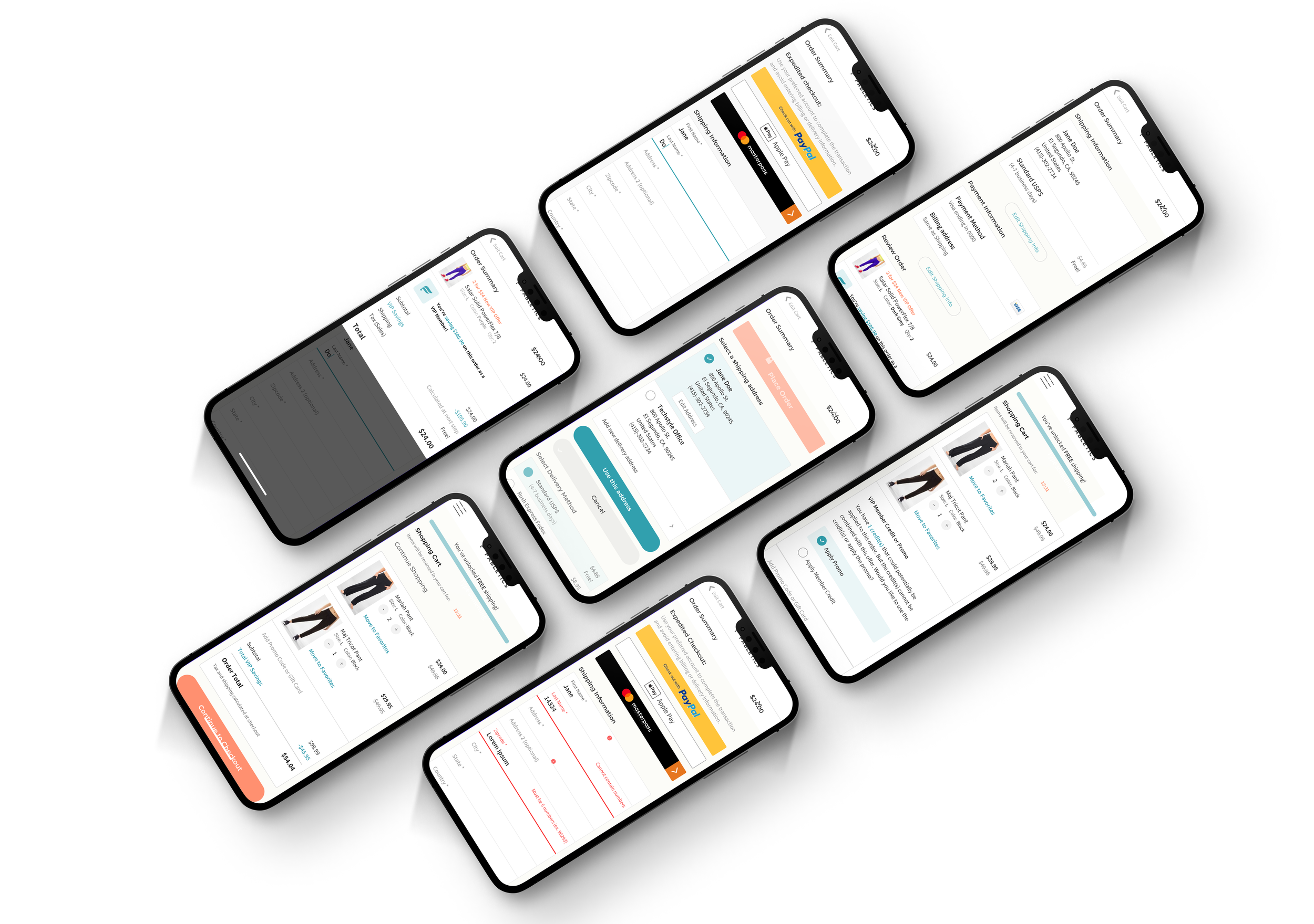
Cart Progress: Control to Mocks at Launch
Checkout Progress: Control to Mocks at Launch

The Launch
Overall the launch was a huge success. Over five business days, the redesign was shown to 50% of leads generating an 8% increase in registration and order conversion from checkout start.
An interesting development was that due to a changed deadline, some of the tracking marred the initial data and caused some panic. However once that was realized and fixed, we saw just how much of an improvement this checkout was!

Leads through the roof!
Leads experienced a 21-26% improvement in order conversion and Lead2VIP conversion.

Big Revenue Lift
Overall the redesigned checkout generated $20-25 Million more revenue for new members and $8 Million more annual sales from existing members

Six Days Later…
In six days after launch, redesigned checkout generated over $81,000 more than old checkout.
Next Steps
Since this was the first user-first driven project done at Fabletics I made sure I was very involved post-launch. Ideally next steps after a launch involve monitoring analytics to ensure we didn’t create any new friction. Sometimes this can lead to panic and an urge to revert, so I was there to user test and assuage any concerns.
Ensure a win
First and foremost, we wanted to monitor metrics (add to bag, units per transaction, conversion, lead to vip sign up, etc) and ensure we were doing better than what we’d replaced.
Avoid Impulsive Decisions
Since user-first was a new concept, there was a lot of trepidation. It was vital to avoid any “sky is falling” type thoughts at the first abandoned session
Continued Enhancement
Although we launched with a massive improvement, features did get cut due to timeline. Now we could prioritize fast follow items.
Rollout to other brands
After the immediate success of this checkout redesign, the CEO asked for it to be rolled out to Techstyle’s other brands. I worked with the other teams to explain our process, decision making, and mock ups.