
NAVIGATION OVERHAUL
The Honest Company // March 2023
The Honest Company was having issues keeping users on the site and leaving before purchasing anything. In March 2023 I was tasked with identifying why, as well as solutions to decrease the bounce rate.
With little existing data to go on, I set out to gather qualitative insights to fill in the gaps, understand our users’ mental model, and come up with a user-centered solution.
For confidentiality reasons I have omitted certain metrics

Role
Lead, UX/UI Design, User Research
Team
One Designer (me), Two Engineers, One Project Manager
Timeframe
March - June 2023 (3 Months)
Tools & Testing
Figma, Usability Testing, Open Card Sort, Tree Testing
Quick Summary
The Challenge
Honest.com had a history of high bounce rate and relatively low conversion to the amount of users reaching product pages. I was tasked with reducing the bounce rate, increasing conversion, and “fixing” the user experience.
The Solution
After exploring our site, competitor sites, and speaking with users it became clear that the problem started with our navigation. If we could make our categorization more intuitive and reflect that in our navigation/taxonomy, we reduce a significant amount of bounce.
How I Contributed
Ran competitor analysis to understand what was an industry standard for navigation/categorization at the time
Gathered internal/external user feedback via user tests on honest.com to create a baseline to measure against. Shared findings and recommendations with executives and stakeholders to align on next steps
Ran card sort exercises to establish the user’s mental model
Validated mental model and improved navigation taxonomy with tree tests
Created proof-of-concept mocks of enhanced site structure beyond navigation for phased out next steps
The Results
The results of the first comparative tree test showed a ~22% increase in taxonomy interpretation, which led to more efficient product findability.
Findability and Discoverability are two separate experiences:
Findability = "I know I'm here to buy moisturizer, I just need to find the right one". You've come to the site for a specific use case but are having trouble finding the exact product for you
Discoverability = "Oh wow, they sell X? I could use that". You're on the site and find something you didn't know you were looking for but want to buy.
This increase in findability resulted in less frustration and bounce, which in turn yielded higher avg. order value, and increased conversion.
Project Details
The Challenge
“The Honest Company wants to provide an intuitive and engaging experience for users and is interested in evaluating the user journey to better understand shopping goals and habits. How well does our existing navigation address user needs?”
Unlike their direct competitors, Honest had a much more varied product category which broke their target demographic into two types of shopper (“baby vs. beauty”).
Initial Steps
Assessing The Situation
Honest only had rough quantitative data to work with, and even that was not definitive. On top of this, given the short timeline to launch, we weren’t able to complete as much user research as recommended. Based on how the site was tracked, the data showed users landing on Honest.com or other landing pages, and only 32.4% reaching a PDP. To complete the picture, I set out to gather qualitative insights.

Discovery
Internal Feedback
Given the short timeline we had to work with, I started with internal interviews to get a better understanding of institutional knowledge and what (if any) frustrations existed
“It’s just confusing”
The most frequent feedback from internal users was that the site was just confusing and hard to shop.

Poor product exposure
Part of the aforementioned confusion came from products not being exposed intuitively, so to remedy this products were strewn across the site randomly.

Personalization
It was a common thought that the reason for such high bounce rates was “lack of personalization” for shopping for baby vs. shopping for beauty.

Competitor Analysis
To gain further understanding of our demographic’s shopping expectations I looked to direct and indirect competitors to compare category taxonomy & standards.
Who did we look at?
Target, Coterie, Huggies, Sephora, HelloBello, REI
What were our parameters?
Navigation/Taxonomy, Homepage, Category pages, product grids & filters
What did we want learn?
Evaluate where Honest.com usability ranks amongst competitors
Review category naming conventions across the industry
Assess how many competitors utilize intermediary category pages
How do our filters stack up against the competition? Is this an area worth exploring?
Takeaways
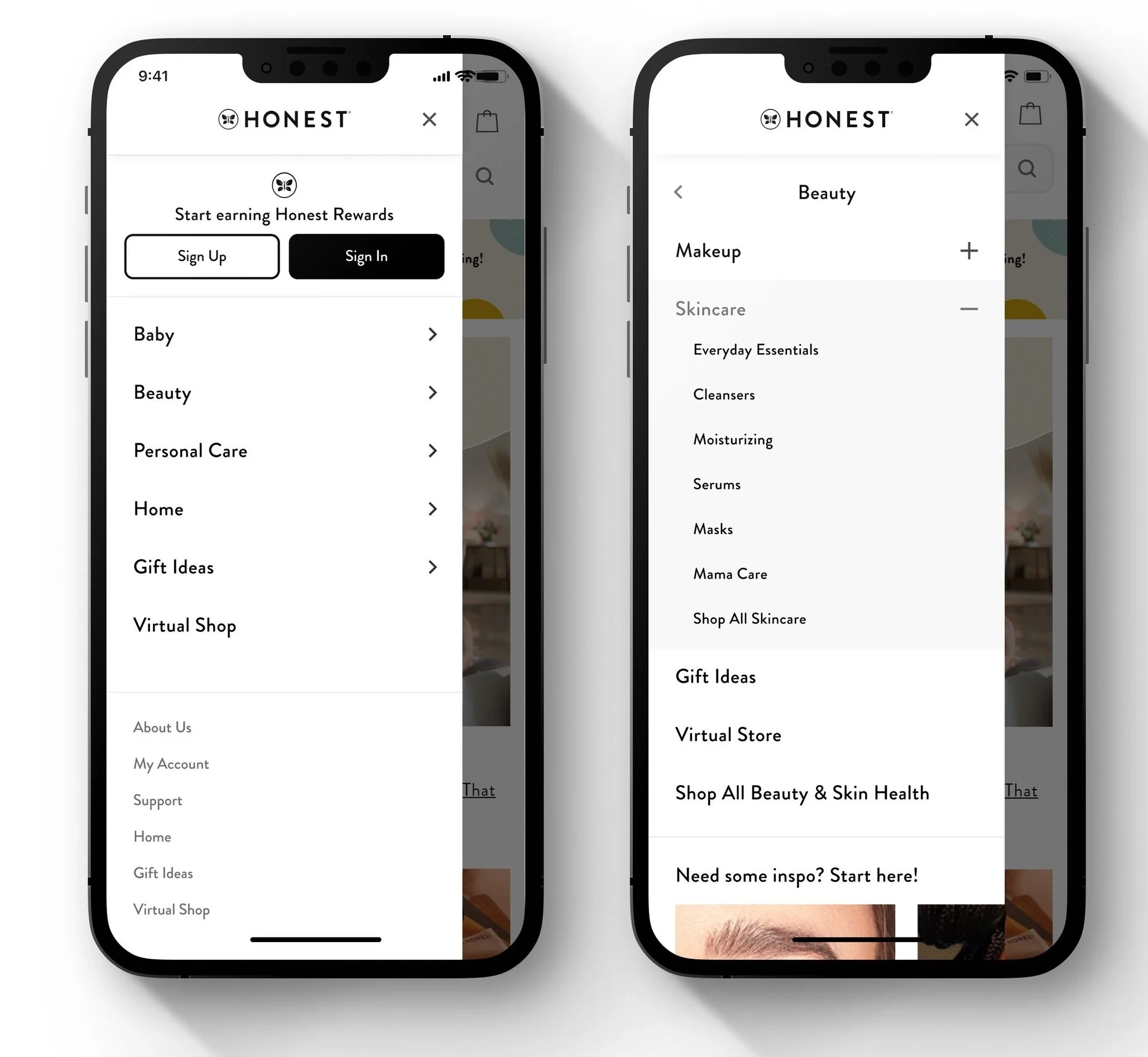
Overall, Honest was suffering from over-categorization. This made it frustratingly hard for users to find relevant products, and most of the time led to product grids with just a few products on them. On top of this, our products weren’t appropriately categorized within our navigation; there was too much cross-categorization going on (an error made by an internal team in hopes of showing all the products everywhere in the hopes of catching a users attention).
To remedy this, we aligned on a “less is more” approach: broader categories, more useful filters for self-service on these broader categories, a re-categorizing of our on-site SKUs to fit within the appropriate grids and filters, and a holistic review of the information archicture of honest.com.
User Research
Last and absolutely not least, while doing the competitor analysis and internal interviews I was simultaneously running unmoderated usability tests on usertesting.com to hear from our target demographic.

Open Card Sort
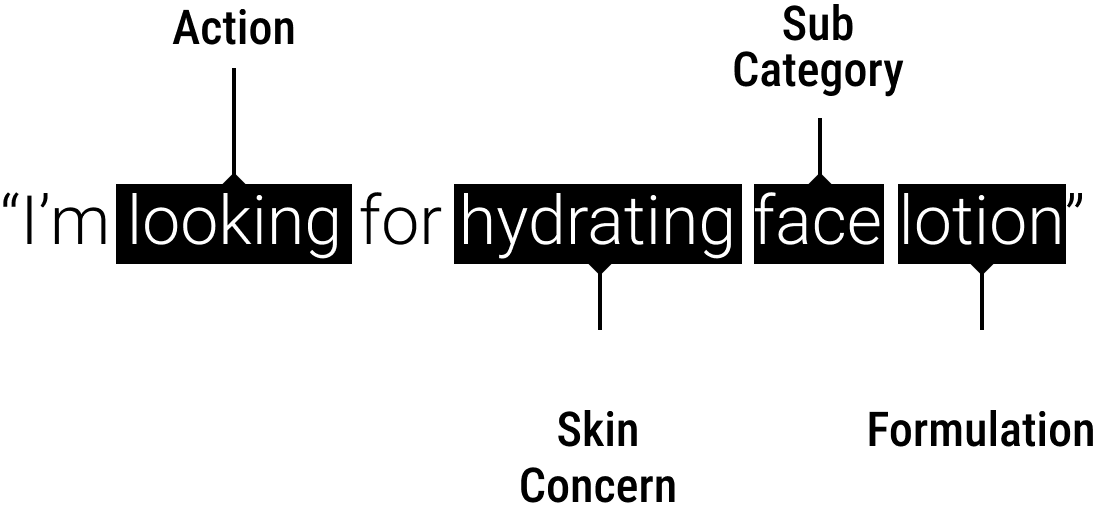
The first answer I needed was if users found our existing navigation labels and taxonomy to be intuitive. To do this, I ran an unmoderated open card sort exercise.
These types of user tests consist of presenting users with numerous “cards” with white label product names on them and asking them to categorize them in ways that make sense.
The outcome gives a clearer picture of our users’ mental model and how they expect to find items categorized across our site (as opposed to how internally a company may feel the products should be grouped).

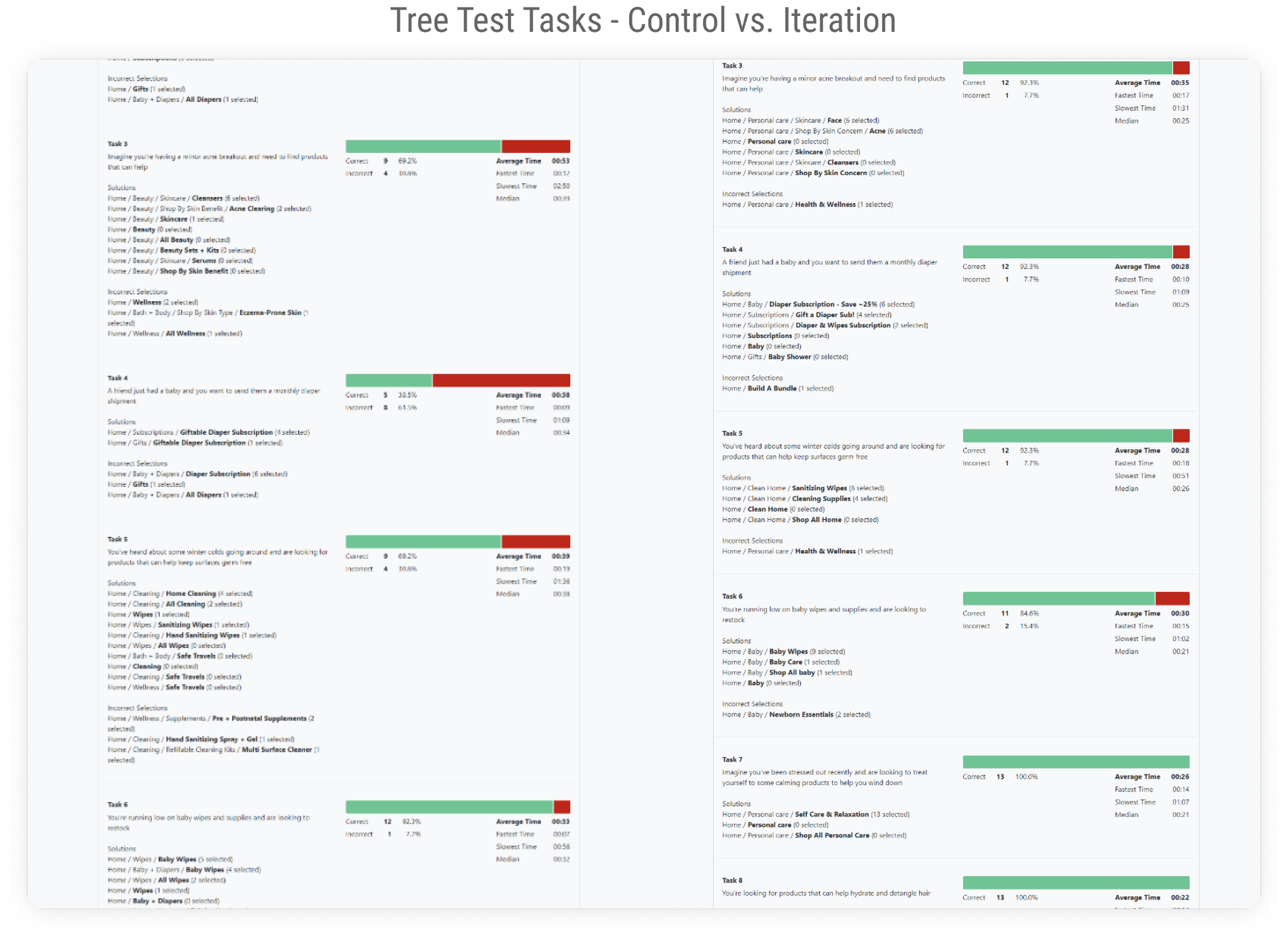
Baseline Tree Test
While the open card sort was running, I created and ran some tree tests on our site’s control navigation to build a qualitative baseline to measure future iterations against.
Tree testing involves building out your “tree” to reflect the navigation/categorization on your website, and then presenting users with a series of scenarios to see where they may expect to find the answer.
This type of testing evaluates if users are able to correctly find products or categories where products their interested in may be located. It also shows how long users took on specific scenarios, correct vs. incorrect guesses, and if users bounced between categories before selecting their final answer.
Key Findings

Keep top level nav categories focused
Current:
Category names are unintuitive and sending users to incorrect grids, and the current solve is scattering the same SKU across multiple grids whether it belongs or not
Ideal:
Reduce SKU duplication across

Consolidate existing sub. categories
Current:
Due to some of our sub categories having a limited amount of SKUs, we should try to combine like items and enhance filters
Ideal:
Dead ends lead to increased bounce. Filters are to sites what sales associates are to brick and mortar retail stores (ie. they provide informative realtime feedback based on user needs)

Holistically optimize honest.com
Current:
The navigation is doing the heavy lifting (education, information, disoverability, upsell, nav, etc)
Ideal:
Let the navigation be the navigation and redesign the site to more efficiently balance the workload
Breaking down user goals
“The beauty and bath + body is confusing to me. Because beauty has skincare in it, but bath and body would also be skincare. I want just one spot for all skin. One spot for all diapers, etc”
- User Tester
The Results
Overall, the open card sorting helped create more intuitive categories and product groups. The results of the first comparative tree test showed a ~22% increase in taxonomy interpretation, which correlated to product findability. The increased findability resulted in less frustration, decreased bounce, higher avg. order value, and increased conversion..
Baseline Navigation Test - Control
Benchmark Navigation Test - Iteration
Phased Timeline
We had 6 weeks to provide a functional MVP to our board of directors. We divided our design process into four phases for the team to tackle. I was in charge of XYZ. Since overhauling the entire site to reflect the nav would’ve taken too long, we opted for the short 6 week MVP approach to start making steps in the right direction. This consisted of:
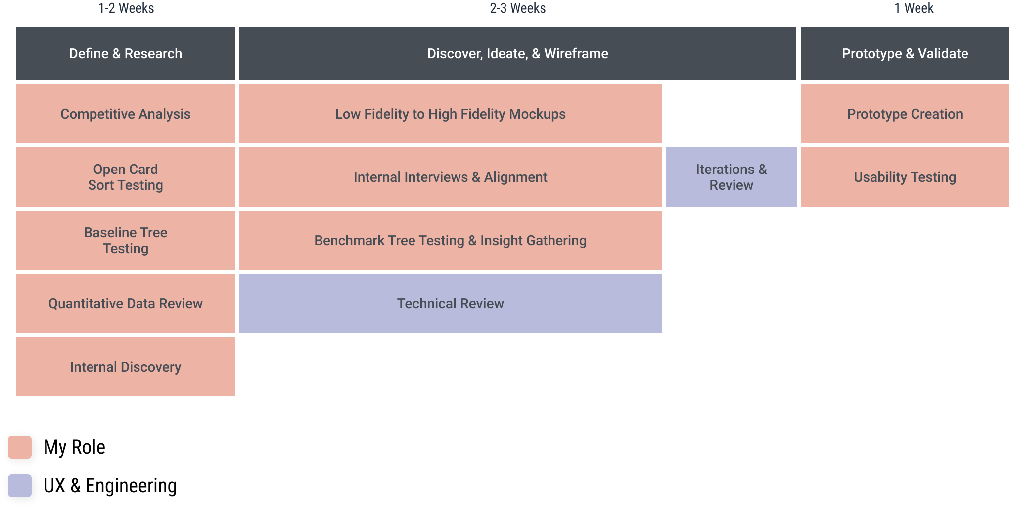
UX Research & Design Timeline
Technical Scoping
After reviewing the initial data with a small internal team we aligned on moving forward with the first iteration of card sorting data, and make subsequent improvements in a “phase 2”. The next step was to meet with the development team and figure out what was feasible for an initial launch just a few weeks away, so I created a Feature Value Matrix.

Feature Value Matrix


The Launch
Overall the launch was the tip of the iceberg, but a success! The UX research, open card sort, and tree testing of the new and improved nav led to increased checkouts, decreased grid abandonment, and more.
Next Steps
Unfortunately as it happens, we were constrained by time and resources and had to launch a de-scoped MVP. The takeaways for the team were to be more transparent and honest with time estimates and feature scoping.
Moving forward, the additional UX recommendations involve:
Information Architecture:
Test and validate improved homepage and introduce intermediary category landing pages
Categorization:
Continued improvements and testing to create more useful product grouping
Filters:
Implement more intuitive filters to
Continued Tree Testing:
Keep iterating towards a more optimal navigation taxonomy
Findability User Testing:
Create tests based on updated navigation