
iOS App
Investor’s Business Daily // Sep. 2017
Investor’s Business Daily is a stock market news and analysis company, as well as creator of multiple investing tools. In 2016, just before I joined the team, they launched their initial iOS app.
After settling at a 1.2 star rating on the app store, they chalked it up to a failure and put it into maintenance mode. Myself and a product owner knew there was a missed opportunity and set out to prove it with qualitative and quantitative data.
For confidentiality reasons I have omitted certain metrics
My Role
Lead UX/UI Design
User Research
Competitor Analysis
UAT
Team
One Designer (me)
Four Engineers
One Project Manager
Timeframe
Sep. 2017 - Mar. 2018
6 Months
Tools & Testing
Sketch, Invision, Usability Testing
Quick Summary
The Challenge
The IBD App was built from a top down approach, not user-first. Therefore it was surfacing what internals felt was the most valuable, and not giving users the features they needed. The question became how might we ensure users are getting what they need from the app in order to boost the rating?
The Solution
Through conducting user interviews with new and longterm IBD subscribers we identified the most common use cases, what features they involved, and how they were being used. Our demographic was desktop-first (it was easier to analyze stocks on a bigger monitor), so the app was simply a way for them to do on the go check ups and research, while the main work was done at home.
How I Contributed
Used Adobe Analytics to collaborate directly with our data analyst. This helped identify usage patterns, popular pages of the website, and when users engaged
Redesigned the iOS App from the ground up to account for the addition of features, and create a more trustworthy and modern UI
Worked with the Marketing Dept. to ensure user friendliness and more lenient paywalls in areas of the site to ensure we were showing off our value prop, rather than just limit all access to features
Ran task-based usability tests and measured success rates to ensure users could accomplish the features they were used to using on the desktop website.
Designed a widget to allow users to monitor specific stock lists without opening the app
The Results
Users who subscribed to IBD Digital through the app had much higher levels of retention than users who subscribed through the website.
On top of that, 37.6% of previous subscribers reactivated within one month of app install.
Shortly after launch, the app store rating jumped from 1.2 stars to 4.7 stars.
The app was a top 3 finalist in Mediapost’s 2018 Appy Awards
Monthly active users for the IBD app increased 61% less than a year after launch


Project Details
The Challenge
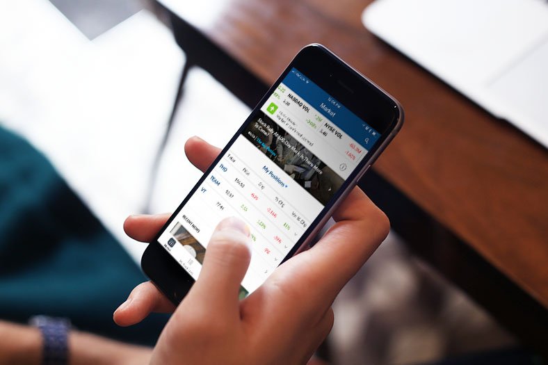
Investor’s Business Daily has been a household name since the 80’s because of their unique approach to stock market research. What started as a daily newspaper evolved into a primarily digital suite of tools, including an app that was launched in early 2016.
Unfortunately, the app was launched to less than stellar reviews and settled at a 1.2 star rating. By the time I joined the company later that same year, it was known internally as a failure. However, because of this, it was up for grabs if anyone wanted to take on the task of fixing it. Enter myself and my PM…
Initial Steps
Assessing The Situation
The version of the app that IBD had published was rated at 1.2 stars six months after launch. From what I could gather from stakeholder interviews, it was created by a committee and personal opinions as opposed to data and user feedback.

Discovery
Internal Feedback
My first step was to meet with stakeholders to not assess their current likes/dislikes of the app, the website, as well as any competitors who were “doing it right”. This would allow us to identify, internally, what the value proposition of the app was and who the primary competitors were.
“Why can’t we be like wall street?”
The majority of feedback from stakeholders revolved around being more like competitors. Diving deeper into this, there were specific aesthetics and features they wanted as opposed to morphing to be more like one or another.

Member Features
Along with better surfacing our value prop was including mobile-first, user friendly versions of our existing desktop-first subscriber-only features in the app. Our members didn’t see the point in an app that didn’t even have the features they were paying for and loved.

Investors.com/store
Surface Value Proposition
The first version of the app was far too conservative in regards to hiding the premium features from non-members. It was leading to not only new users not seeing the value, but current subscribers not seeing the point of an app.

Investors.com Smart Select Ratings - 2018
Competitor Analysis
To gain further understanding of our demographic’s shopping expectations I looked to direct and indirect competitors to compare category taxonomy & standards.
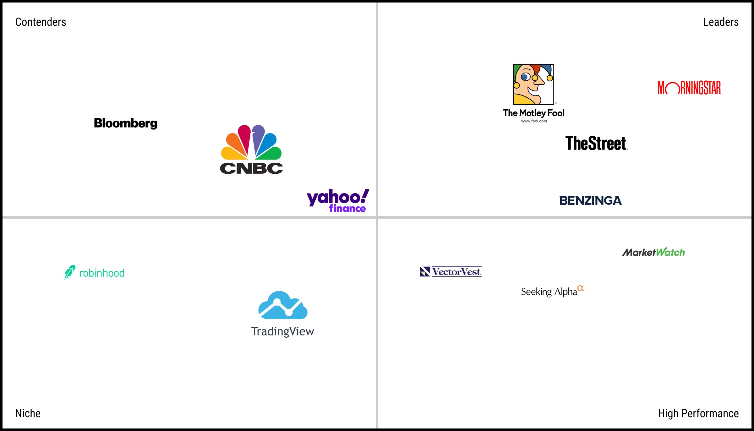
Who did we look at?
Bloomberg, Motley Fool, The Street, Morning Star, MarketWatch, Trading View, and others
What were our parameters?
Membership gated features, investing news and tools, stock lists, app vs. web/desktop site features
What did we want learn?
Evaluate how our feature-set stands up to competitor apps to ensure value
Identify the right blend of premium features to show vs. hide behind a paywall in order to increase subscription sign ups
Where did our users find value on our website and what was wrong with the app experience? (ie. feature missing, feature not usable, etc)
Since our demographic leaned slightly older, what would be considered “too innovative” in terms of ux patterns.
Takeaways
Overall, the IBD App was just not a complete experience. It lacked features that were given freely on the website and in competing apps which resulted in users uninstalling, and didn’t even include the premium features to existing subscribers. The aesthetic and ux patterns were outdated and unintuitive leading to distrust and frustration. And finally, the app had no purpose or benefit over the mobile version of the website.
To me, the clear missing link was empathy for the users. Next steps were to speak with some subscribers (recent and long term) to get a better understanding of their needs and where they found value on the site, as well as work with stakeholders to come up with the right balance of paywalled features that would result in added functionality, as well as more sign ups.
S.W.O.T. Analysis
To further align with the team I put together a SWOT (strength, weakness, opportunity, threats) Analysis. This is helpful when tackling a project to better understand business context and clarify a product definition

Early “Proof of Concept” Iterations
Since V1 of the app was considered a failure, there were very limited resources the stakeholders were willing to invest in a redesign so we were unable to do any baseline usability testing.
However, the stakeholder interviews, competitor analysis, and feedback I was able to aggregate from the app store and our customer support team painted a clear enough picture to get started.

User Research
I generally try to do user research before projects begin, as well as throughout the entire process to an extent. Unfortunately with this project and UX being new at IBD, I wasn’t able to run any tests with real users until a V2 was built in test flight.
Internal vs. External Usability Tests
User research and usability testing had never been done before at IBD, so myself and my PM had to improvise.
We borrowed a camera from our video department to record the devices, and invited users in the LA area to come by the office to find out about a new product. We also posed as marketers since telling them we were directly involved with the project may have skewed how critical users may have been.
Lastly, we measured time on task, pass/fail rate, and task criticality to determine just how severe of an issue it was.
The Tasks
Show me the latest story that gives you an overview of the market
Please watch the most recently published video
Create a new stock list and add Amazon (AMZN) to the list then delete it.
Open a different personal stock list. Move the stock at the bottom of the list to the top.
Sort your new list by highest-to-lowest price percent change.
Update the Market page to show the IBD 50 instead of Stocks On The Move
Show me the Composite Rating for Apple. Now show me the definition for “Composite Rating.”
Open a list of all news stories about Tesla
Send a comment about the app to IBD.
Show me a full-screen weekly chart for Facebook (FB).
Tell me how IBD determines what stocks are on the IBD Big Cap 20
Show me an IBD Stock Checkup
What did we learn?
Internal Test Results
One universal truth of UX and usability is that internal users are not the same as external users. They understand the product deeper than our users since they’re in it every day 9-5, they also hold biases as to what may be the most valuable element of an app/website.


External Test Results
External users on the other hand give a more accurate and actionable feedback since they depict how users actually engage.
Having said that, both provide value and insights but should be valued differently (business requirements vs. user value).


Key Takeaways

Redesign app onboarding tutorial
Pre-launch:
We had designed a slide show tutorial to highlight app features and how to use certain features to new users, but since it included screens from the app, some users didn’t understand and thought they were in the app already.
Update:
Made onboarding imagery more obvious to be instructive rather than a picture of the actual app

More purpose-driven Friction
Pre-launch:
It had been a business requirement to include things like requesting the location of our users or asking for more personal information than necessary. The users did not like this and claimed it would be a deal breaker for them.
Update:
Integrate more contextual requests. Instead of asking a first time user to accept app notifications, ask when they take a positive action (ie. add a stock to a watch list from a quote page or article)

Make videos easier to find
Pre-launch:
Video was an important medium for IBD, but the stakeholders were adamant about video being integrated with all the written news. However users struggled to find videos since they were made much less frequently than articles were written.
Update:
Add a “Videos” subcategory tab to the News page so users could quickly view all content at once, as well as integrated on the “All News” tab.


The Launch
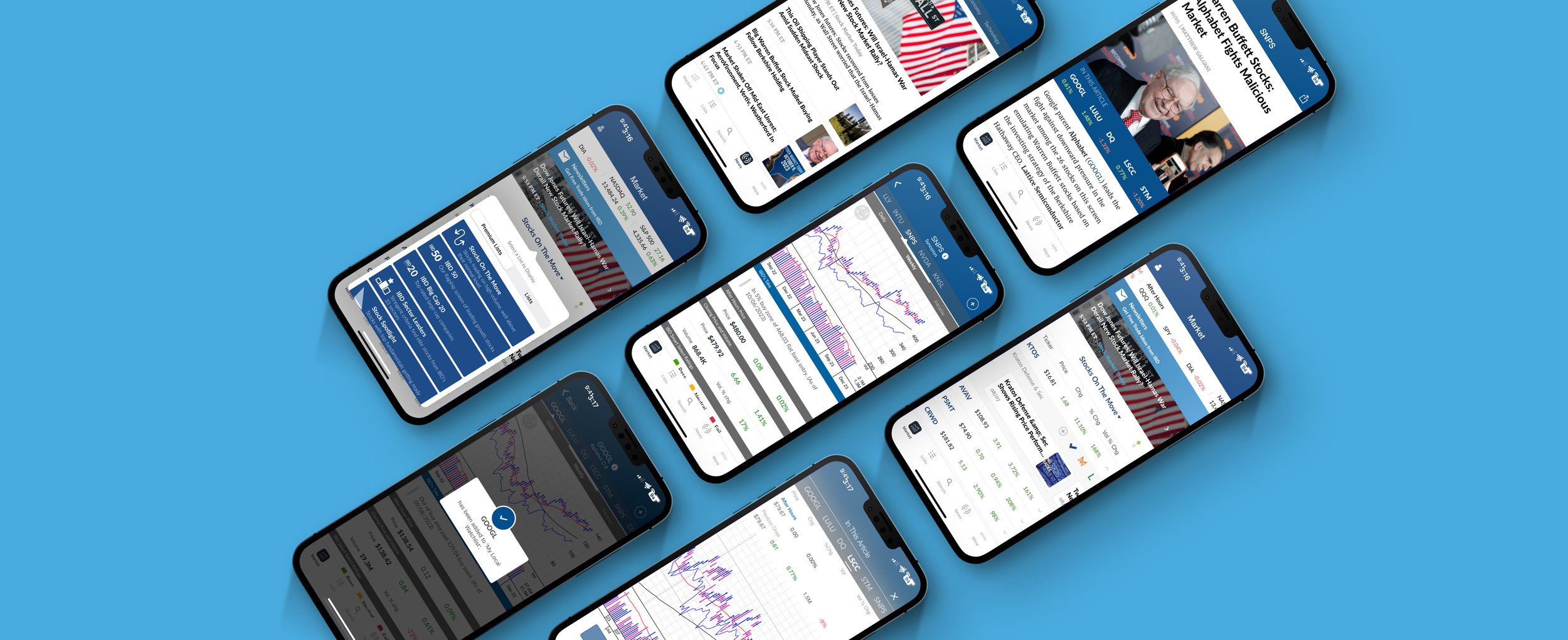
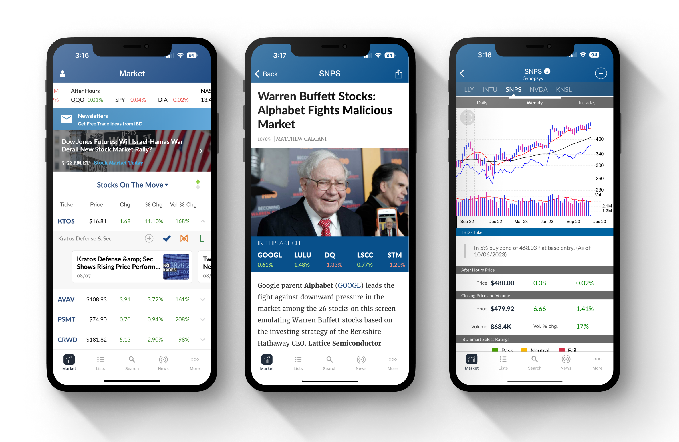
We launched the redesigned app after making some minor tweaks based on the usability testing feedback and were met almost immediately with positive user feedback. I was also able to provide redesigned screens for the app store to show off some of our updated UI.

(App store store screens I designed for the 2.0 launch - 2017
Post Launch Feedback
Next Steps
Launching the new and improved app was a huge step forward. Not only did it increase engagement, retention, new subscribers, and revenue, but it introduced the stakeholders to the value of user feedback and testing that paved the way for more successful product launches in the future.
Moving forward, we wanted to focus on:
User-First Culture
This was the first time user research had been taken into account and it paid off in a big way. Now that we had some traction, continue pushing forward for a user-centered mindset.
Win backs
Reach out to users who had left negative reviews of the old app to try and get a second chance.
Widgets
Although this app design was a major improvement, there was more we wanted to do but ran out of time. Exploring home screen widgets for example.
Continued Enhancement
Keep speaking to and testing with users to gather insights towards feature discovery
Site Enchancements
Now that the app had caught up with the majority of industry standard UX at the time, the website needed work to have more parity with the app
Android
The majority of our users were on iOS when we started this redesign, but there were a good number of users reaching out asking for an Android app