
PDP Redesign
The Honest Company // May 2023
The Honest Company had never had a UX Designer on staff before, and therefore their site was very lacking in intuitive user-friendly (not to mention mobile-first) designs. It was brought to my attention that the PDP was seeing significant bounce rates, and I was tasked with finding out why and if there was a low level of effort way to resolve it.

My Role
Lead UX/UI Design
User Research
Competitor Analysis
Team
One Designer (me)
One Engineer
Timeframe
Mar. 2023 - May. 2023
Two Months
Tools & Testing
Figma, Usertesting.com
Quick Summary
The Challenge
How might we better present product pages to our users to ensure they’re getting the information they’re looking for?
The Solution
I ran a baseline user test on our site with a focus on PDPs, information retention, findability, and more to get a better understanding of our users mindsets and expectations. The feedback was invaluable and I found out we were in trouble in almost all aspects. The solution was to create a design a more efficient hierarchy and include info our users needed but that we didn’t have.
How I Contributed
Worked with executives to align on requirements, goals, and measures of success
Ran the first ever comparative user test on an Honest PDP
Gathered insightful user feedback to inform a low/med scope redesign and increase add to bag and conversion
Created efficient usability patterns with other projects in mind for future scalability (navigation and information architecture redesign, diaper/beauty/skincare/etc PDPs, enhanced grids, etc)
Iterated through versions of low, hybrid, and high fidelity mock ups
Created rapid prototypes for more accurate feedback from internal and external users
Initial Steps
Assessing The Situation
The Honest Company had four PDP templates for different each category of their business: beauty, baby, skincare, and cleaning. I started with baby because our data showed that had the biggest bounce rate.
I discovered that the PDPs hadn’t been updated in multiple years, and when they had last been designed it wasn’t done by a UX professional; in other words it was not designed with the user in mind, not data driven, poorly optimized, etc.
Below is the control PDP broken up into five screenshots:

At a glance, the clear issues were poor utilization of space, unintuitive hierarchy, too text-heavy, and overall just required too much effort from the user.
User Research
As with most projects, internal users had their opinions as to why the PDP “wasn’t working” which I took note of, but my priority was to hear input from the users directly. I put together a comparative user test starting with Honest Company’s diaper product page vs. Huggies diaper product page.
The Tasks
Note: The same set of tasks were run on both the Huggies PDP test and Honest PDP test in order to keep the results accurate.
Once the new page fully loads, move on to the next step (note: please close any popups).
Without leaving this page, please find info around diaper quantity per pack.
Overall, this task was [Very easy (1) - very difficult (5):
How helpful is the information on this page in helping you decide if this product is right for you? Please explain your answer.
How helpful is the product imagery? Please explain your answer
In your own words, how would you describe this product and it's benefits?
What information, if any, would have helped you while shopping this page?
What three words would you use to describe that experience?
If you had a magic wand, what would you do to improve that experience?
Key Takeaways
Overall the feedback came down to:
User’s like when there’re less ingredients in something
Reorganize PDP to better match users mental model
Simple, quick education
Emphasis on fabric quality and ingredients
Consolidate print thumbnails
Show, don’t tell
More UGC, testimonials, and feedback from actual parents rather than just Honest Company marketing copy
Better diaper feature highlights
etc
Breakdown of Redesign
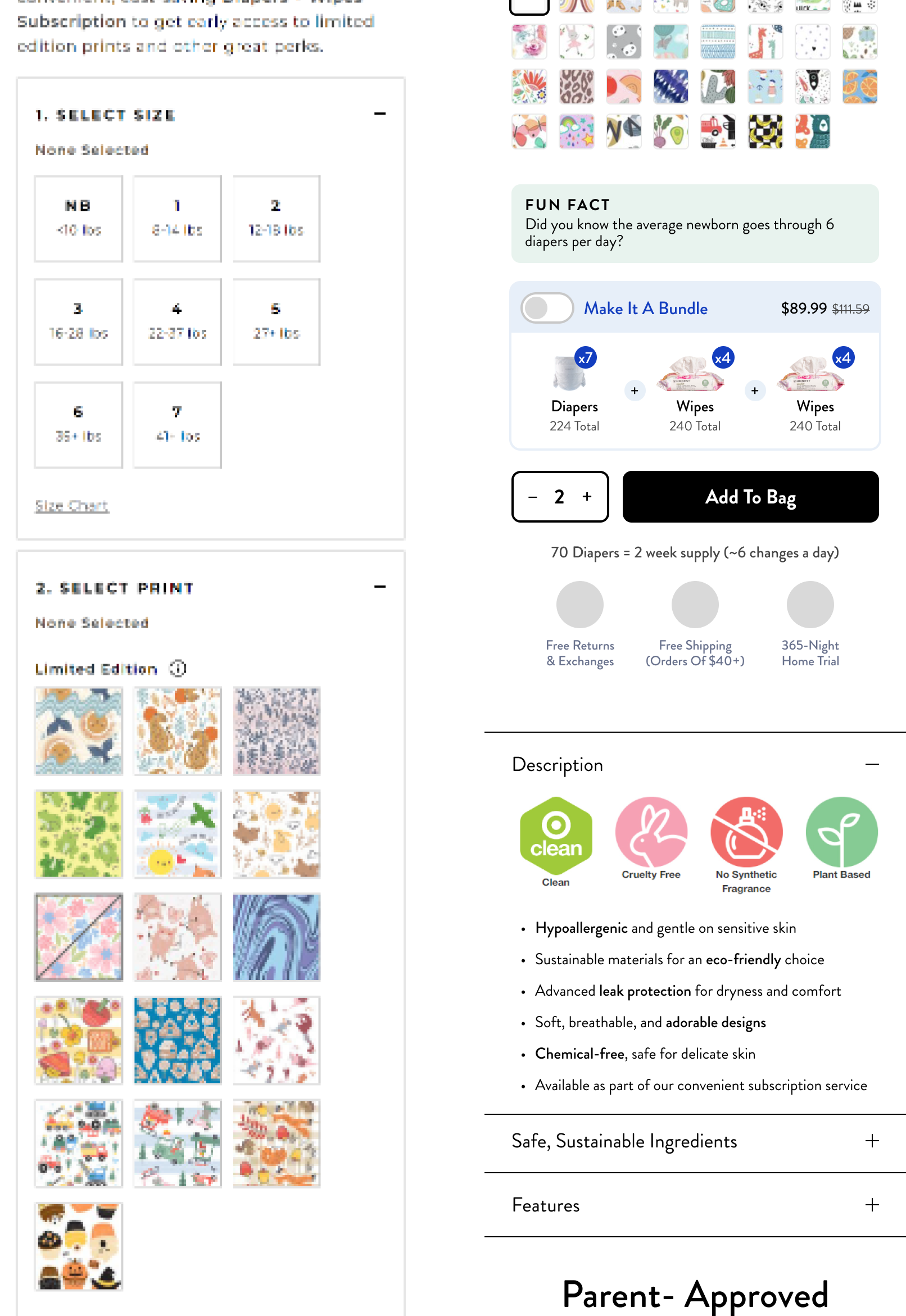
Title, imagery & selectors
Before scrolling, an user should be able to see helpful information. In this case I accounted for:
Per pack pricing
More straight forward product imagery as opposed to editorial
A thumbnail gallery for users to scroll rather than go one by one
Smaller and more helpful size selector (with Qty. per pack) and print selections

Subscription upsell and product info
The selectors are just so unnecessarily big and push down so much information, so a big goal of mine was to solve for that and surface more relevant info sooner
Since patterns repeat by nature, I shrunk the thumbnail size while still keeping it tappable
Added a “fun fact” to help educate potential new parents who were unsure how many diapers they needed
Added an option to quickly switch to our best selling Diaper and Wipe Subscription
Surfaced product info as collapsible accordions to be conscious of vertical space
Feature Highlights and Reviews
A large piece missing from our PDPs was highlighting what made Honest diapers special, and unbiased user testimonials. I attempted to solve this with:
A conceptual section with a 3D diaper that can be rotated to spotlight different features and the ability to swipe through or tap directly on points of interest
An auto-animating section of testimonials from actual users

Detailed Upsell & Data
At this point, the control experience is still showing print selection followed by an upsell. The redesign saved enough space to include:
An upsell with actionable information
More social proof as to why these diapers were the right choice
Specific (placeholder) callouts around the features of diapers and how they’d benefited customers

Show, don’t tell
This side by side of control vs. redesign demonstrates that "a picture is worth 1000 words”.
Utilizing demonstrative imagery with short titles and descriptions I was able to accomplish what pages of text attempted to, as confirmed in benchmark user tests.

User Generated Content (UGC)
Further down the page (where the control design was showing size/quantity info for some reason), I included a simple cross sell as well as a new conceptual section where we could surface moderated posts that included a hashtag created by our marketing team, #WhyILoveHonest
This content is valuable to users as a form of social proof attached to actual humans and even imperfect photos to add to the authenticity

Not Pictured: FAQ & Review sections due to the fact that these were controlled by a 3rd party and I confirmed we were not able to make any changes