
Fitness App
Techstyle: Fabletics // February 2020
In early 2020, Fabletics was working to figure out alternate ways to engage with their users, as well as increase the value of their monthly subscription. One of the more popular ideas was to create a fitness app that user’s enrolled in the Fabletics Subscription would get access to, along with the other existing benefits.
I was tasked with the quick turnaround of designing this app as well as mentoring a jr. designer through the process.
For confidentiality reasons I have omitted certain metrics
My Role
Lead UX/UI Design
User Research
Competitor Analysis
Team
Lead Designer (me)
Jr. Designer
Three Engineers
Timeframe
Q1 2020 - Q2 2020
Tools & Testing
Sketch, Invision, Zeplin
Quick Summary
The Challenge
How could we design a fitness app in an incredibly short timeline that would add enough value to the existing Fabletics Subscription that it might increase user sign ups?
The Solution
In order to meet the tight deadline we had to forgo user interviews, but thanks to in depth competitor analysis and clear business requirements we were able to create a useful, intuitive, and enjoyable app experience.
How I Contributed
Worked with executives to align on requirements, goals, and measures of success
Mentored a jr. designer who had recently joined the team to teach process and design skills
Work closely with stakeholder to define critical points in the user journey along with the business goals
Identify common UX patterns among industry leaders and design a clean UI for ease of use
The Results
Since the app was created behind closed doors, we were unable to user test it pre-launch. However once the app was live I was able to gather qualitative feedback and found out users loved it
Adoption and engagement over the first month were better than expected
Shortly after the launch there was a noticeable increase in Fabletics memberships over the course of a quarter
Currently, the app is sitting at 4.8 Stars from 6.2k reviews
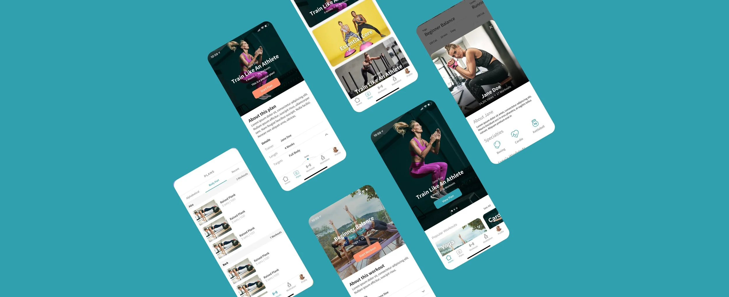
Breakdown of Redesign

Home Page & Coaches
The homepage was the repository for the most recently added plans and workouts
The hero section featured the newest/most popular workouts
Scrolling down the page reveals horizontally scrollable sections for secondary and tertiary workouts
Lastly, not pictured here, there’s a section to learn more about the coaches and what their specialties are if you’d rather find a workout that way

Scheduled Plans
At launch we were designing for just a few plans at launch (business wanted to ensure success before investing in more plans), we decided to present them vertically with engaging visuals
The individual plan pages featured extra information about the length, muscles targeted, and a monthly and weekly view of upcoming workouts
My personal favorite piece I designed was the radar chart that gave users a better understanding of what this workout plan consisted of